

Did you know that about 90% of the information that is transmitted to the human brain is visual? That’s right. So when you write wordy posts and blogs for sharing knowledge with others, chances are, the readers do not retain a major chunk of what you are trying to communicate.
A lot has been talked about the importance of visuals within the content and similarly, the importance of visual content. Visualization of data has myriad applications in many industries and business verticals. It is important to understand its role in enabling business growth so that you can choose the right visuals and visualization tools that can help you achieve your goals.
Before we even delve into the minute details of data visualization and the various ways in which you can implement it, let us begin with understanding what data visualization is all about.
What Is Data Visualization?
Data Visualization is, to put it simply, a field that deals with the graphical representation of data. It is a highly interdisciplinary field since data visualization finds its use in multiple fields such as marketing, education, data analysis, and IT, among several others.
Data visualization uses charts, maps, graphs, and other similar visual elements to represent complex data in an easily interpretable manner. One of the biggest takeaways from data visualization is that even the most complex data and complicated messages can be made easily understandable.
Data visualization is generally classified into two major types: Static and Interactive.
- Static: Business communication till recently, was a largely one-sided process, wherein companies used static means such as paper or a display to present their messages. In such mediums, the reader or the audience does not have any interaction with the brand and thus, the communication is largely unilateral.
- Interactive: Since humans learn faster through actions and interactions, companies had to shift to more interactive ways for communicating with the audience. Having interactive visual content allows businesses to gather intelligence that they can apply to their strategies.
What Are the Benefits of Data Visualization?
As emphasized before, data visualization offers many benefits for diverse fields. Over the past decade, highly accessible tools and technologies have made it easier for people to visualize data in a better way. Data visualization finds applicability in multiple fields and across the board, some benefits stand out more than others:
- Facilitates better and faster decision-making
- Tracking down potential flaws and errors in data
- Identifying trends and patterns within data
- Gaining insights on a specific subject
Apart from the above benefits, another key advantage of using data visualization in marketing, especially on digital platforms is that it can help you get more visibility than simple textual content. It depends on a very simple statistic. The human brain can process images about 60,000 times faster than text. So in order to make your content engaging and impactful, including visuals is important.
Moreover, the field of data visualization has benefited greatly through the emergence of Big Data, Business Intelligence, and Digital Storytelling. Apart from these, 3D and 4D technologies and designs have also created an urgency for organizations and people to shift to data visualization so that maximum impact can be generated.
Data Visualization in 2021
Over the past decade, data visualization has grown to become more accessible owing to several software and tools which can let users create visuals easily. Infographics are increasingly being
used to communicate a lot of complex data, making it more engaging and easier to retain for readers.
Here are a few unique ways in which data visualization is being used around the world today, that you can leverage in 2021:
Data Storytelling
Stories have been a part of human civilization since the very beginning. As human beings, we learn and relate through stories, and can create new worlds through the power of our imagination. This inherent creativity combined with the right visualization tools can create enthralling graphics and designs that present the findings from your data aesthetically.
Here is an example of how data storytelling simplifies complex data and presents it in a visually appealing and easily decipherable way to the audience:
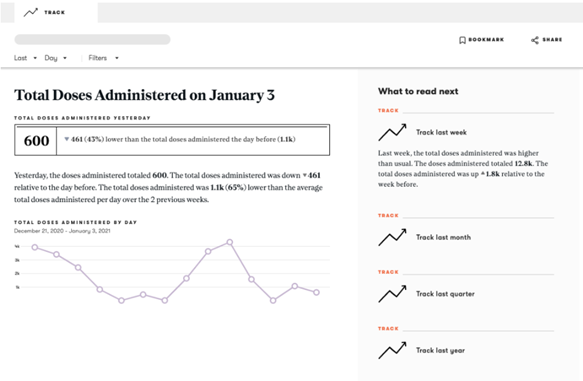
Source: narrativescience.com
Businesses have increasingly realized the potential of being able to tell stories by representing data in a visual format. The importance of doing so was amplified in 2020 during the pandemic when the entire world was trying to comprehend a lot of data and statistics to understand the situation. Organizations and individuals who could present this information creatively through infographics and data storytelling rose to greater heights during the pandemic.
If you are not sure how to gather data in your organization, you can run customer feedback or employee feedback activities. This will result in a chunk of gold mine of data which you can use for your process of data visualization.
Augmented Reality (AR) and Virtual Reality (VR)
Augmented Reality and Virtual Reality are technologies that have been around for a while but have only recently been recognized by enterprises for commercial use. In recent years, the market for AR and VR has grown significantly.
It is estimated that the AR and VR market will reach $30.7 billion in 2021, and by 2024 it would grow to be valued at $300 billion by 2024. If you truly register how a steep growth that is, you already know that you should be investing your resources in using AR and VR in your business.
VR data visualizations are a great way to bolster collaboration among your virtual team members. Mixed Reality (MR), a field birthed from the combination of VR and AR, has enabled organizations to use 3D visualizations which are great for interpreting large datasets.
An industry that has transformed through the advent of AR and VR, is the gaming industry, wherein companies in the sector are now forced to upgrade their graphics and make the experience even more interactive.
Academics and Education
Academic fields are not far behind in this race of utilizing data visualization to its fullest potential. Did you know that people are 323% more likely to follow directions correctly if given illustrations, as compared to people who are given text-only directions? The role of educators is to impart knowledge in a way that educates and leaves a mark on impressionable minds.
Considering this, many educators are now choosing to leverage digital visualization methods such as animations, graphics, and infographics to conduct their classes. This trend has especially taken off in 2020 since almost all institutions moved to online classes.
Moreover, if you are an author of a journal article published recently, you are already aware that academic journals now ask for graphical abstracts, as opposed to the textual abstracts used earlier. Graphical abstracts provide a visual representation of your research and offer a more engaging form of abstract for your paper.
The pictorial representation of your research is likely to attract more readers, and give them a better understanding of what to expect from your paper.
Smart Devices/Systems
Internet of Things (IoT) is another emerging field in which data visualization plays a crucial role. Data Visualization has a very instrumental role in defining visual analytics and its usage in IoT devices. Smart devices and systems are now a way of life in many parts of the world, wherein a simple voice command can be used to carry out many tasks that would otherwise have to be done manually. For a smart device to get that intelligence, there is a lot of data that is programmed into it.
IoT devices actively gather a lot of data, and that big data is then analyzed to make the devices more personalized and user-friendly. You did not honestly think these devices read your mind, did you? IoT devices run on the big data fed into them, and for that data to be effective, large amounts of data are collected, polished, visualized, and analyzed, resulting in effective decision-making mechanisms. If you plan to integrate IoT in any of your business verticals, data visualization tools are inevitably going to be a part of your processes.
Business Intelligence
Last but not in the very least, one of the biggest applications of data visualization is within business intelligence. While we have already discussed this aspect to a certain extent, the field of business intelligence uses data visualization in many ways. In fact, they go hand in hand in almost every scenario.
In order to gather and utilize business intelligence, companies need data visualization tools because the volume of data is that great. Going through that much data is not viable anymore, so companies use data visualization to represent and understand data in a better manner.
Businesses can easily analyze user data to identify patterns and trends that can help them make better decisions and strategies. Moreover, companies can also leverage data visualization to present their content in a much more simplified way to all their stakeholders. Using data visualization tools can help organizations in ensuring clearer and more transparent communication with their customers as well as employees.
In Conclusion
Data Visualization as a discipline has come a long way from being used by just data scientists. Today, organizations, as well as individuals, use data visualization to present trends and to interpret useful data in a much more comprehensive manner.
Visualizing data helps readers engage with the content more, and also helps them understand complicated data much more easily.
Not to forget, data visualization potentially saves a large number of resources and a ton of time in companies that have to depend on data for decision-making and strategies.